Flags (2024)


Humans and nature: two hurt lovers
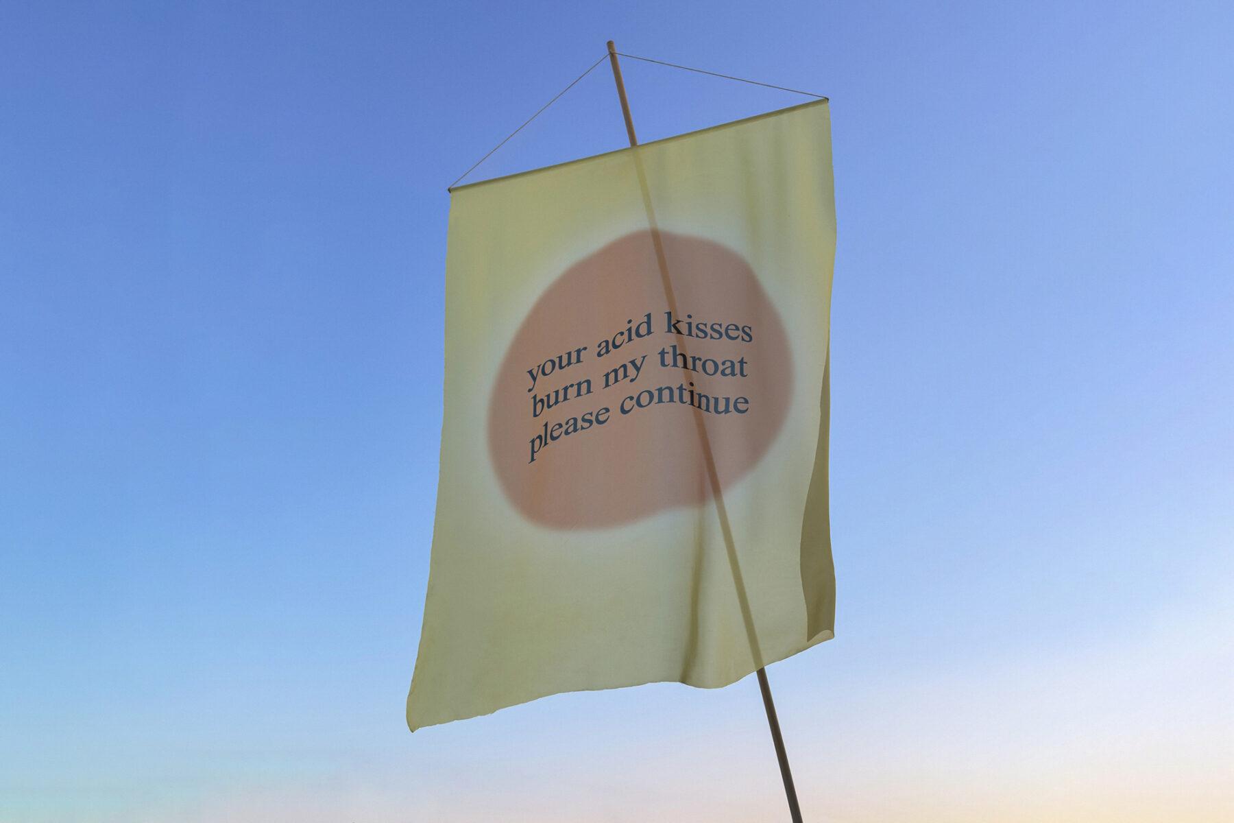
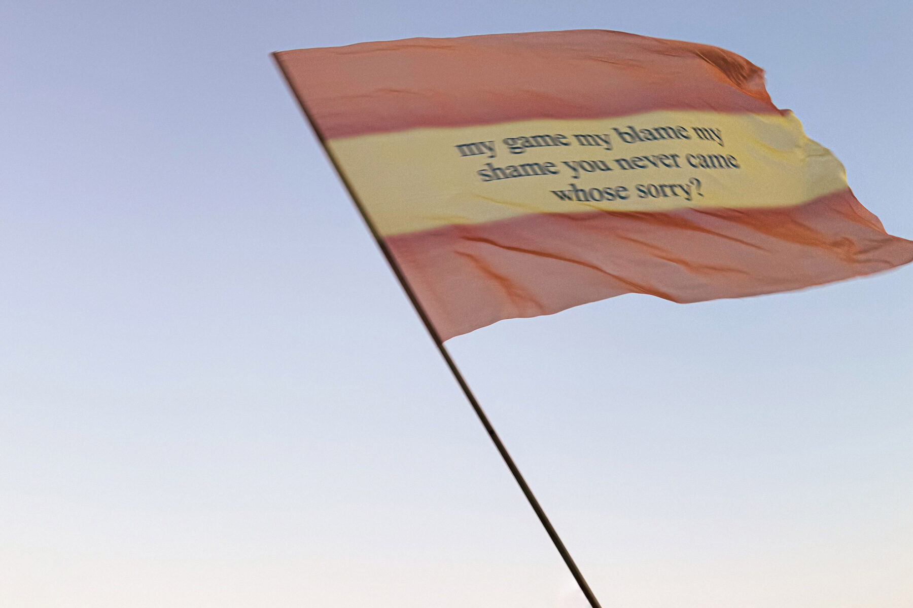
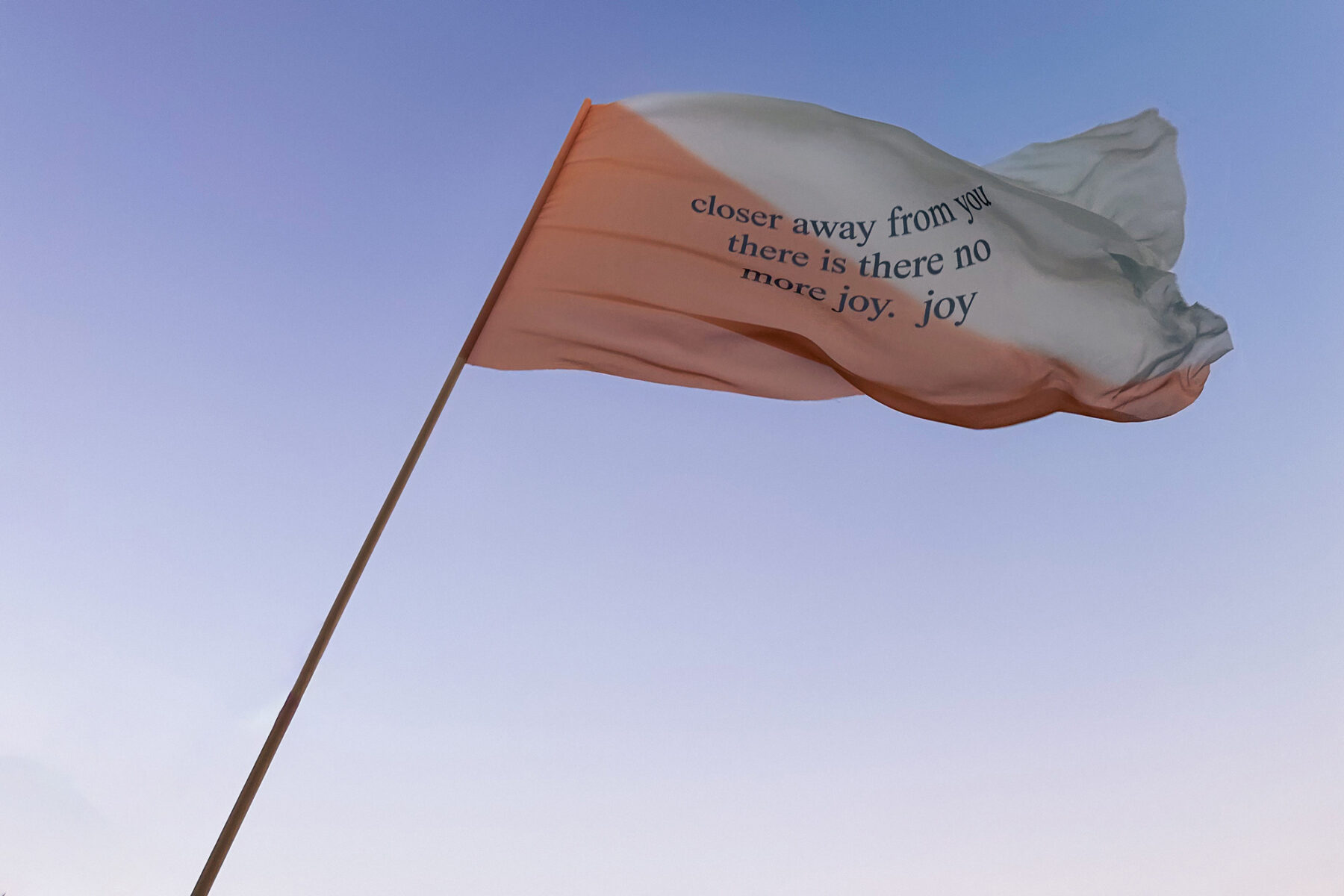
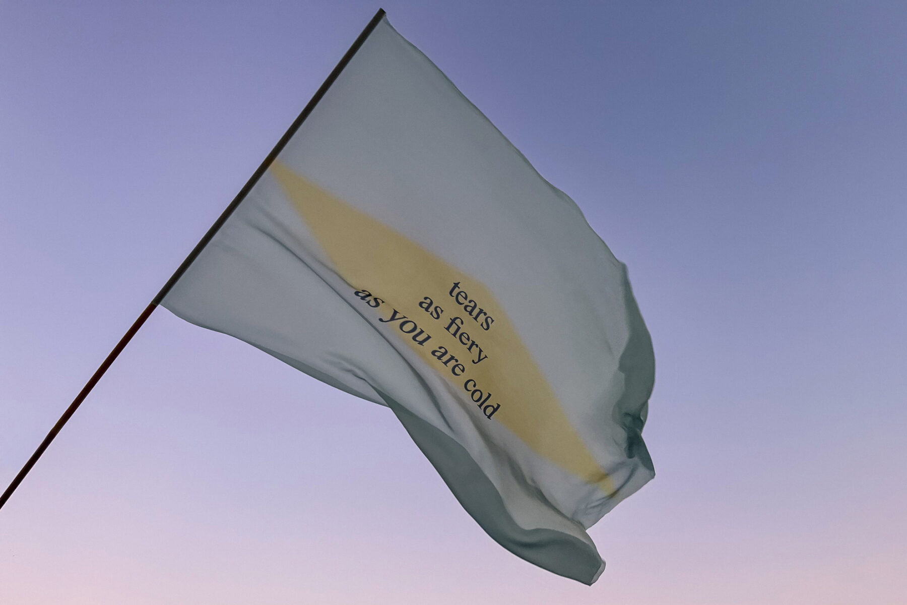
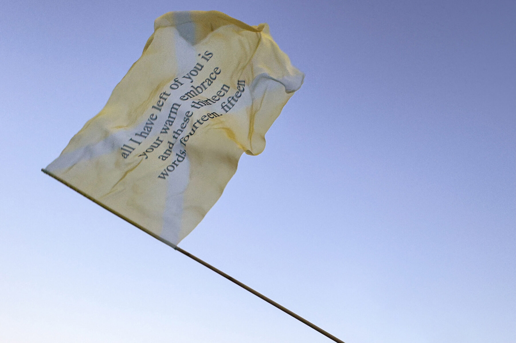
In their seminal Ecosex Manifesto, Elizabeth M. Stephens and Annie M. Sprinkle propose to see Earth more as a lover than mother. In a metaphor for the relationship between humans and Earth, this series of flags carries messages between two lovers in pain. The imagined exchanges come from edited excerpts by French Emperor, Napoléon Bonaparte’s notorious love letters to his wife, Joséphine de Beauharnais. In sentences that are grammatically and syntactically incorrect, a further breakdown of communication becomes evident. The flags vaguely invoke the design language of national flags and are printed in vivid pastel yellows, warm oranges, and icy blues—colors associated with the natural elements. This series is part of the performance “My throat is burning”, a walking procession first presented at Zappeion Megaron.
Print on textile, Flags: 100 x 140cm, Banner: 150 x 100cm. Edition of 3 + 1 A.P.
Presented with Nitra Gallery in Zappeion Megaron, at the parallel performance program of Art Athina 2024, "Happy me, happy we", curated by Nicolas Vamvouklis.
My pitch was simple: Flags borne by environmental immigrants. Vibrant colors. A beautiful, imposing, and loud performance. And, definitely, no literal pictures of fires or melting ice.
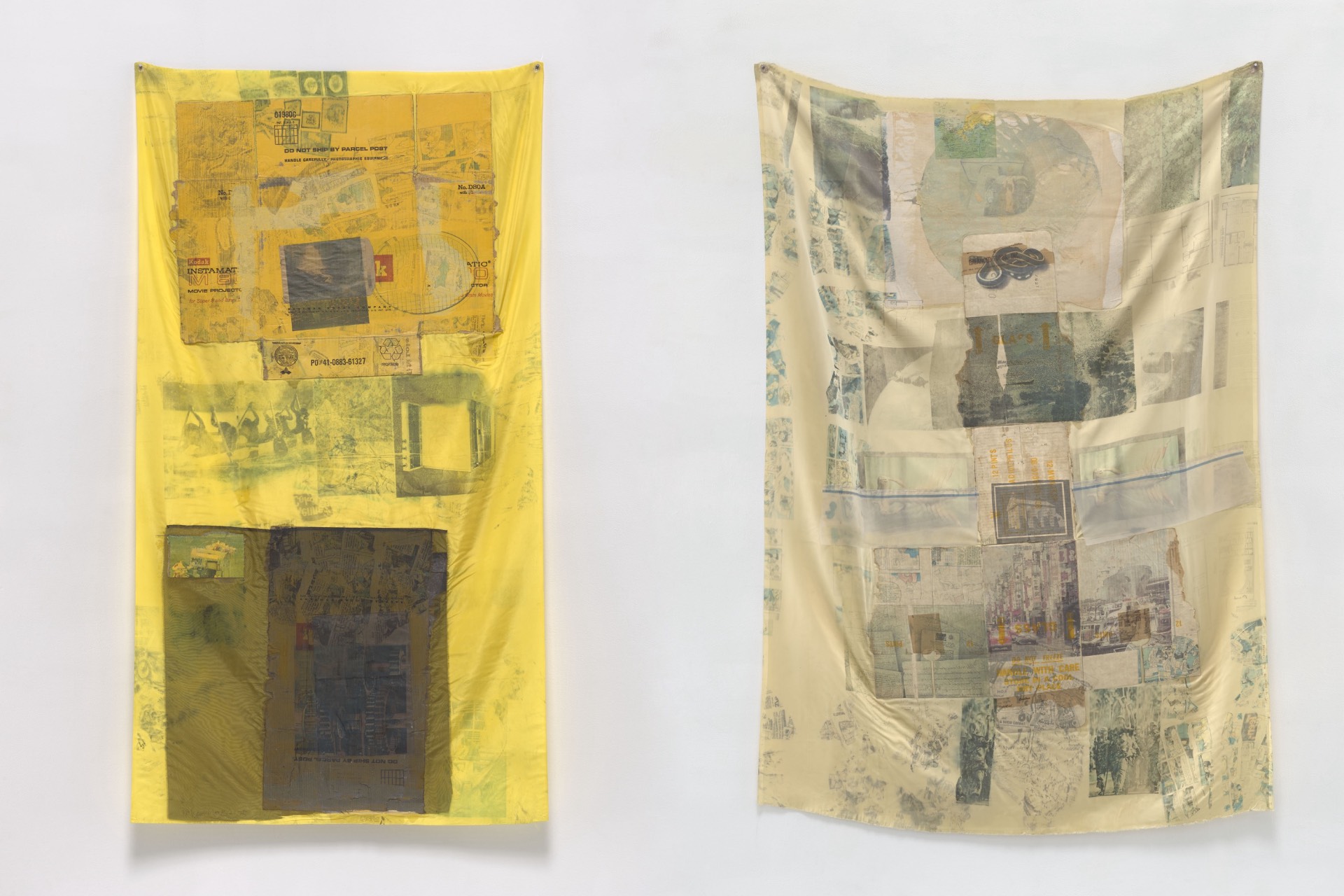
Initially, I wanted to create the flags entirely by hand. I had long wanted to experiment with fabric and color. But after a few failed attempts to use the same ink-transfer technique as Robert Rauschenberg’s “Hoarfrosts” series, I realized that only digital printing would achieve the vibrancy I wanted.
Ironically, despite their seemingly simple design, these flags went through more revisions than anything I’d worked on before. Some drafts were entirely new concepts. I was stuck on the idea of them hanging on a wall rather than existing as moving, functional flags.
Below are some of those rejected drafts… Evidently too literal, something I was desperately trying to avoid.


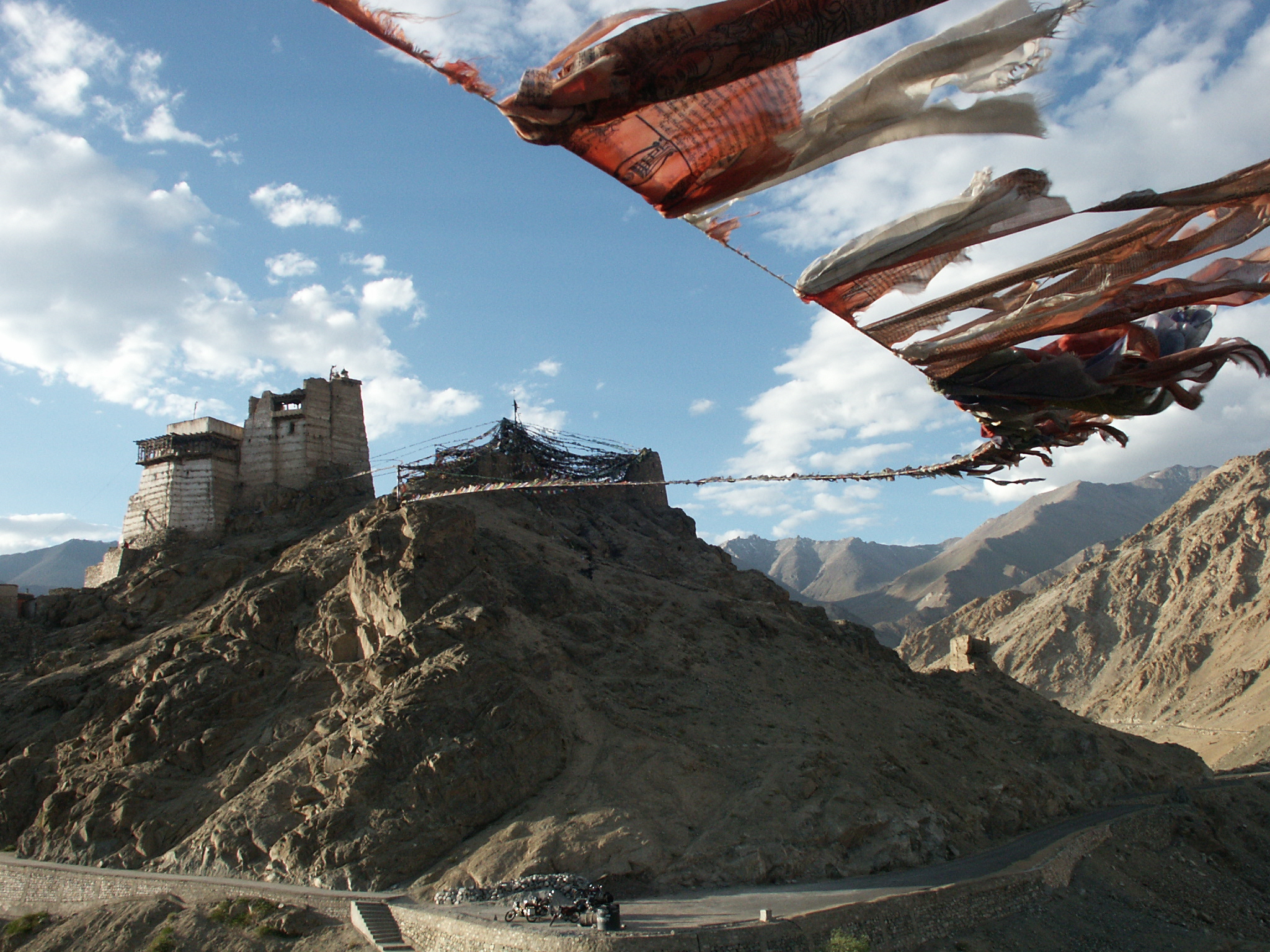
When I hit a dead end, I usually go back to the beginning. One enduring image from my research into flags was that of prayer flags: an element in Tibetan Buddhist practices. These are colorful rectangular cloths printed with texts, prayers, and symbols, strung along mountain peaks, monasteries, temples, and homes.
Buddhists believe the wind carries their blessings across the world. Essentially, they function as talismans, offering protection and healing.

This idea of talismans led me to a breakthrough: flags with messages of goodwill. Love letters, in a sense. And who better to draw inspiration from than one of history’s most infamous love-letter writers?
French Emperor Napoléon Bonaparte’s letters to Joséphine de Beauharnais were obsessive, passionate, and volatile. They married within a year, yet he later divorced her for failing to provide an heir. Still, he continued writing. Professing undying love in one letter, then declaring he never wanted to see her again in the next, only to return with renewed passion later.
As I read his letters, I realized that by today’s standards, Bonaparte wasn’t exactly an ideal lover. He was possessive, jealous, and erratic. This contradiction helped me shape the final concept: instead of blessings, the flags would carry an imagined exchange between two heartbroken lovers—humans and nature. If this were an actual relationship, we’d be the toxic ones.
The intersection of love, desire, and ecology has been explored before—sexecology long predates my work—and offered just the framework I needed.
This was the first time I’d ever included text in my work. I handwrote the messages first, loving the immediacy of the process.
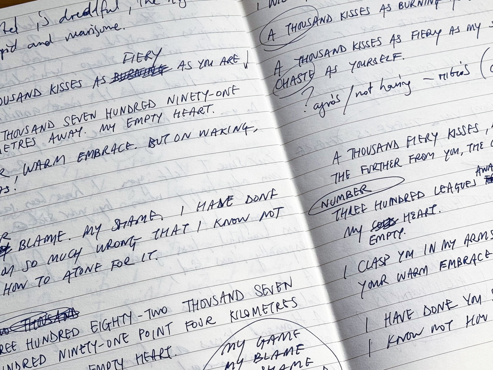
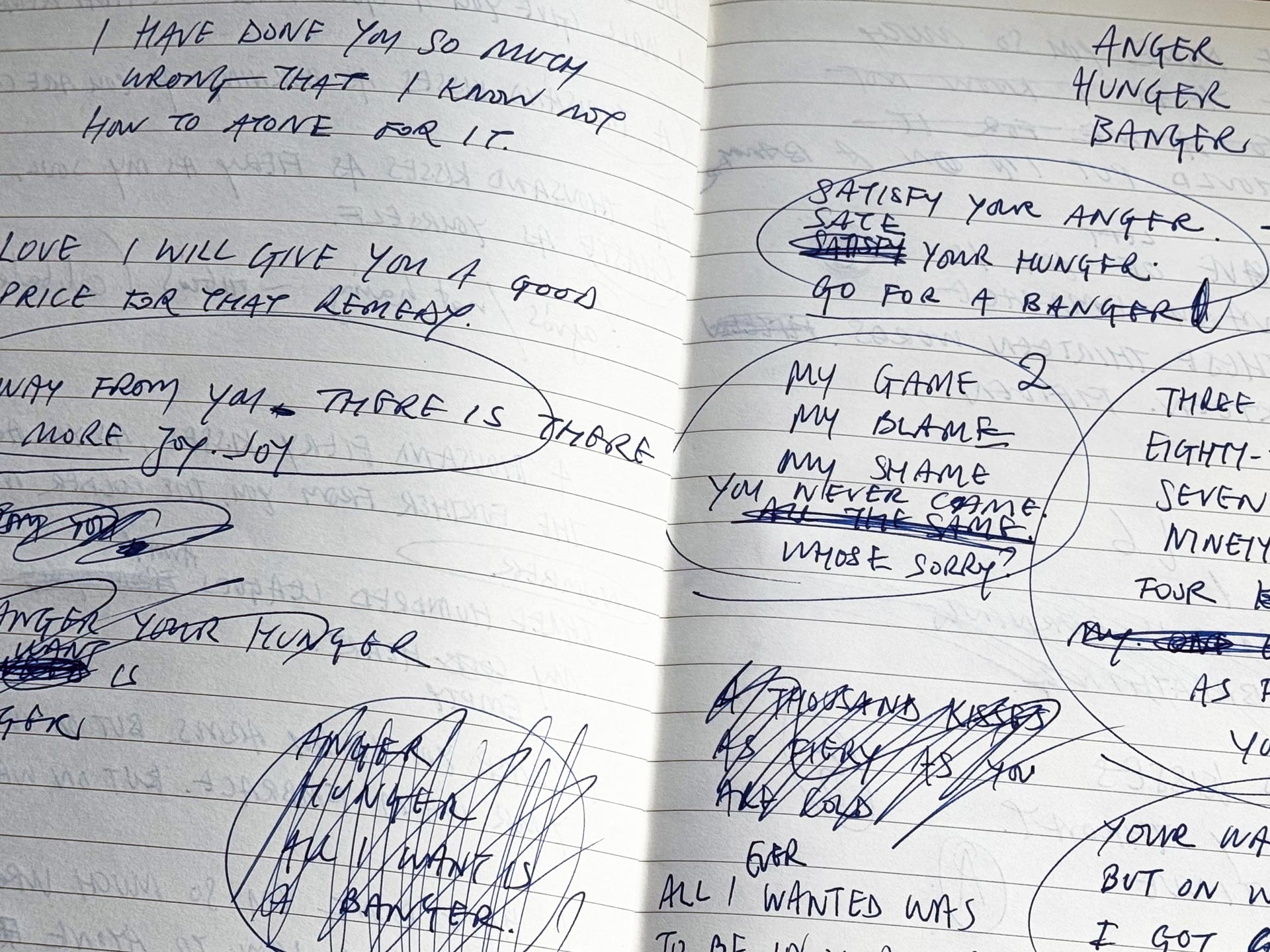
Once the text was finalized, designing them was quick. The first batch felt too reminiscent of Lawrence Weiner, but I soon arrived at something more elegant, minimal, and refined.
Bright yellows and burnt oranges blend with icy blues, alluding to earth, fire, light, water, and ice. The flag shapes subtly reference national emblems.
Printing the flags turned out to be an unexpected adventure. The printers I originally contacted had machines that had just broken, and recalibrating them would take over a week—far too late for me. They referred me to a colleague who could finish the job in two days. When I looked them up, I found a glowing review on a Christian Orthodox website, praising them as specialists in ecclesiastical prints and products. A friend joked that if the Church approved, they must be excellent. And indeed, they were.
I can’t help but smile at the irony: my flags, speaking of acid kisses burning throats, printed alongside icons of the Virgin Mary and saints. A divine intervention, surely.

